Audit your higher ed website with this self-assessment. Get tips for digital fundraising, mobile UX, and AI discoverability to engage Gen Z students and alumni.

Anne Stefanyk
Published:
April 23, 2026
Updated:

Summary
• Boost young alumni giving by integrating digital wallets like Apple Pay or Google Pay: Make it possible for donors to complete a gift in under 60 seconds to reduce friction and encourage participation.
• Build trust with Gen Z by ditching stock photos and embracing real, unposed visuals: Showcase user-generated content and individual student stories on your website to demonstrate authenticity.
• Shift your fundraising appeals to focus on individual impact, not just institutional progress: Instead of general requests, share specific stories of how donations help real students, which resonates strongly with Gen Z.
• Make it simple for young alumni to find and register for events they care about: Clearly display networking opportunities, career support, and social events on your website to foster community and engagement.
• Consider using AI to personalize the website experience for returning visitors: Greet alumni with custom dashboards and relevant content to show you understand their current needs and career stages, boosting engagement.
• Optimize your website content for AI search engines with conversational keywords: This ensures your institution is discoverable by Gen Z students using tools like ChatGPT for their college search.
Gen Z is the generation born between 1997 and 2012. As current high school students, college students, and young alumni, Gen Z is the prime audience for your university’s digital content. But is your higher education website meeting their needs effectively?
The top college websites are user-friendly, accessible, mobile-compatible, and unique. They offer the authenticity that students and young alumni need to feel strongly connected to their alma mater. If your website isn’t clearing that bar, it could be time for a Gen Z-focused reset.
A Gen Z-friendly website is especially important as more Gen Z members become young alumni. Gen Z's philanthropic engagement has increased by 22% since 2021, making your young alumni a key audience for your university's fundraising efforts.
Below, we’ve created a self-assessment tool with questions to help you determine whether your website is meeting the needs of your Gen Z audience, organized by key website features. Use these guiding questions and tips to help you determine your website’s current state and growth path.
Morning Consult’s Most Trusted Universities report found that, among the four generations surveyed (including Millennials, Gen Z, and Baby Boomers), Gen Z is the least likely to trust higher education institutions. As your digital home, your higher education website is among your strongest tools for building trust with Gen Z students and alumni.
Gen Z craves social proof in the form of unfiltered reality rather than curated experiences. Your website should appeal to that preference by:
These content strategies ensure your digital presence reflects and prioritizes student voices.
Young alumni donors want to see the immediate, tangible impact their contributions will have before deciding to give or engage with your alumni giving program. To meet Gen Z's demand for authenticity, impact stories should focus on individual stories rather than general institutional updates.
For example, avoid generic, nebulous fundraising requests like “Please give to our annual fund.” Instead, send an email asking young alumni to “Help first-generation student Sarah fund essential cancer research to complete her senior thesis.” The second option pulls potential Gen Z donors directly into the story of a real student on your campus who needs help.
Your higher education website must be fully mobile-optimized, as a Harmony Healthcare IT survey found that Gen Z spends an average of 6 hours and 27 minutes on their phones every day.
A seamless, mobile-optimized giving experience is an essential step toward making alumni giving more convenient and less intimidating for Gen Z.
Your website should look good on any device, whether visitors are using a laptop, an Android device, or an iPhone. Keep these elements in mind when optimizing your website for mobile devices:
Your institution can further enhance engagement by creating mobile-friendly online forums or Facebook groups to foster a sense of community among young alumni.
Digital wallets such as Apple Pay, Google Pay, and PayPal are now the third most popular way donors give to nonprofits, surpassing traditional methods like checks.
If your donation checkout process requires entering a 16-digit credit card number and a billing address, Gen Z members won’t take the time to complete their transactions. Integrate one-touch payment options via digital wallets to reduce friction and increase young alumni giving.
An EAB survey found that nearly half of high school students now use AI tools such as ChatGPT and Gemini during their college search, a sharp increase from 26 percent in spring 2025. If your website is invisible to AI search tools, it’s invisible to potential applicants.
GEO is the term for optimizing a website to appear in generative AI search engines for specific queries. Users tend to interact with AI-powered search tools much more conversationally than with traditional search platforms, because they can ask multi-part questions and receive personalized answers.
To ensure your website appears for highly-targeted searches, Kanopi Studios’ guide to AI for higher education recommends providing “specific information on your website that highlights your unique credentials and offerings.”
For example, if your coastal university wants to increase traffic from potential applicants looking for schools by the beach, you could include keywords such as “universities with the best ocean views” and “colleges 30 minutes from the beach” on your student life page.
The National Alumni Survey discovered that only 14% of alumni believe their institution has a good understanding of their current career or life stage. Increase alumni engagement and retention by creating secure portals where they can log in and see personalized gated content, such as a custom alumni or student dashboard that displays relevant information, deadlines, and upcoming events.
Potential and current students, as well as young alumni, want to feel included in your university’s community. They want real-time, transparent information to help them navigate your application process, student life, or the post-grad experience.
Higher education website design and development isn’t just about how your website looks. Gen Z wants to find answers and information about the questions and causes they care most about, such as:
Don’t make website visitors hunt for this information. Use your main navigation menu to share links to essential resources, including your campus security details, environmental sustainability reports, and DEI policies.
The National Alumni Survey found that the vast majority of alumni (86 percent) are very satisfied or satisfied with their student experience, but just 50 percent feel very satisfied or satisfied with their alumni experience. This stark contrast highlights a critical gap that higher education websites can easily address by improving event discoverability.
Though considered a digital-native generation, Gen Z alumni actually crave community. They rank networking opportunities, career support, and sporting events as the three most valuable services offered by their alma mater, demonstrating a clear desire for engagement. By spotlighting relevant event opportunities, your website can help them find their alumni niche.
Make it easy for Gen Z website visitors to find opportunities to connect, such as fundraising events, sporting events, networking meetups, and giving days, on your online calendar. Ensure your calendar offers all the need-to-know information for each event, including how to register, date, time, location, and any associated costs. Additionally, to fully support their desire for community and career development, offer clear information about local alumni groups to join, virtual career prep panels and webinars, and mentorship opportunities with current students.
So, how did you do? If you answered yes most of the time, congratulations; your website is probably in pretty good shape for engaging Gen Z. If you had a few more nos than you’d like, don’t panic. Start by addressing your site’s infrastructure, ensuring it's mobile-friendly and optimized for AI search. Then, build on your approach by layering in the personalization, community-building, and authenticity that Gen Z is looking for. As a result, you’ll be able to build a website that engages your core audience and helps them feel at home with your university.
Subscribe
See how modern advancement teams bring alumni engagement and fundraising together.
Plan faster. Execute better
Explore free templates designed for alumni and fundraising teams.
.png)

.avif)
Anne Stefanyk
A strong donation page can be the difference between an inspired gift and a missed opportunity. With donors expecting a fast, trustworthy experience, the design and strategy of your giving page matter more than ever.
In this article you’ll find best-in-class donation page examples from schools, universities, and nonprofits, as well as actionable takeaways to help your institution inspire more gifts.
💡If you want a page that inspires giving and syncs seamlessly with your donor database, check out Almabase’s Giving Module.
Punahou leveraged their 175th anniversary celebration to create their most successful fundraising campaign in school history. The Ku'u Punahou campaign raised over $176 million from more than 12,800 donors with 40,000 individual gifts. The campaign effectively connected historical legacy with future vision, emphasizing how gifts would support cutting-edge learning environments, expand need-based financial aid, and inspire students to "pursue lives of purpose".
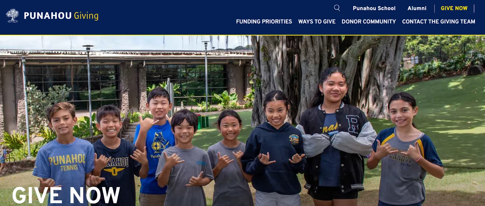
Why it works: Their donation platform provides clear funding priorities including the Punahou Fund for current needs, PunsUnited for student financial aid, and specific capital projects, while offering multiple giving vehicles from cryptocurrency to IRA distributions.
Takeaway: Tie major fundraising campaigns to significant institutional milestones while providing clear, varied pathways for different donor interests and capacities.
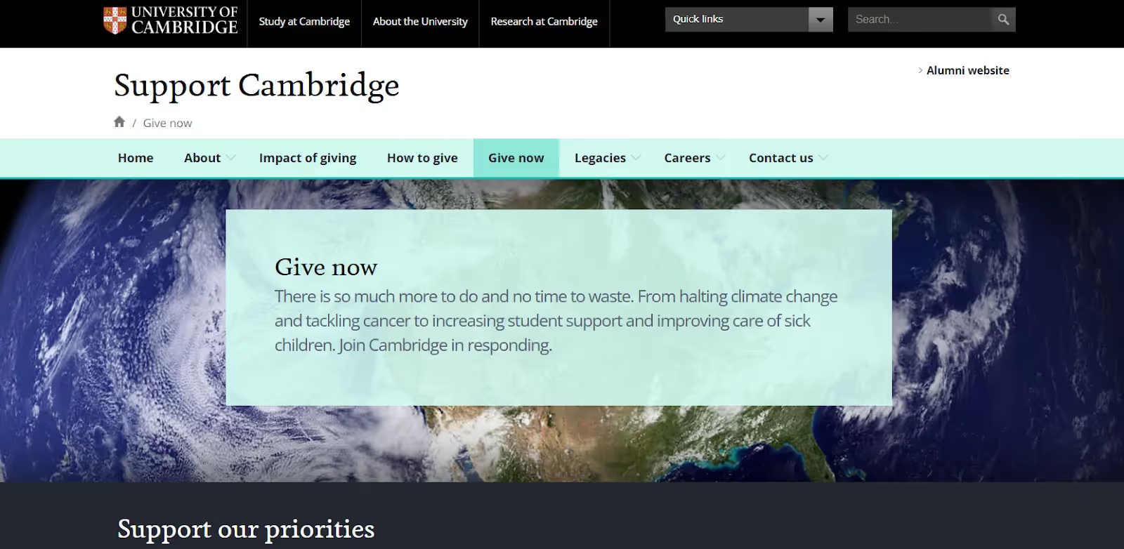
Why it works: The platform supports over 150 academic departments, faculties, and research institutes, offering donors a comprehensive range of causes from student support (including scholarships and bursaries) to cutting-edge research spanning climate change to cancer research, plus historic preservation and global outreach programs.
The platform is genuinely international-friendly, supporting multiple currencies and UK Gift Aid (adding 25% to donations). It uses various payment methods including international bank transfers, and provides tax-efficient giving structures through partnerships like Cambridge in America and Transatlantic Giving Circle, making it accessible to donors from the US, Europe, India, and beyond.
Key feature: Comprehensive cause selection across all academic disciplines combined with seamless international giving infrastructure.
Takeaway: Offering diverse funding priorities while optimizing for global accessibility significantly expands both donor engagement and gift potential.
UCLA’s donation page emphasizes the collective impact of gifts of all sizes, framing every donation as a valuable contribution to a larger circle of support. The page spotlights the university’s multi-year fundraising drive, presenting goals and clear priorities such as student scholarships, faculty research, and campus initiatives. Donors can choose from a wide range of designations: schools, departments, or specific programs, and the form makes it easy to give once or set up a recurring pledge. Campaign progress updates and donor stories reinforce momentum, while the blue-and-gold branding keeps the experience unmistakably UCLA.
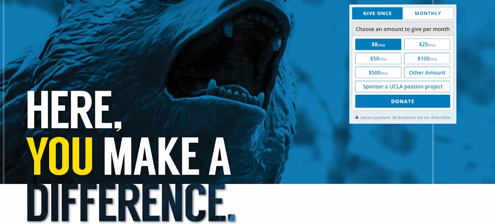
Why it works: By reinforcing that every gift counts and supports a shared mission, UCLA creates an inclusive and motivating environment for donors at all capacity levels. This sense of community nurtures donor loyalty and encourages repeat giving, from modest contributions to major philanthropic commitments.
Key feature: Messaging that connects individual gifts to a broad, impactful community mission.
Takeaway: Position donations as part of a collective effort that transcends the institution, inspiring donors with a compelling sense of shared purpose.
MIT’s donation page uses an interactive grid of impact cards instead of a traditional banner. Each card highlights a key funding priority—such as “Approximately 40% of MIT’s operating budget relies on unrestricted dollars,” and “Over 25% of first-year graduate students are supported by fellowships.” Donors can hover over each card to reveal concise impact statements and click “Learn More” to dive deeper or give directly to that area.
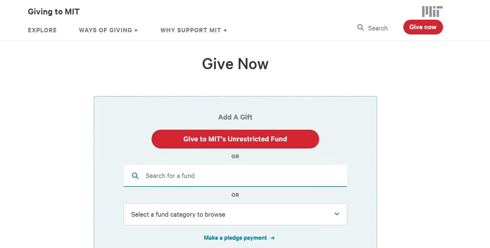
Why it Works: The card-based layout engages donors by inviting exploration and discovery, turning passive scrolling into active interaction. By surfacing bite-sized data points about financial aid, unrestricted funding, and fellowship support, MIT appeals to diverse donor motivations, whether they value student support, institutional flexibility, or graduate research. The clear, quantifiable facts build credibility, while the hover-to-reveal design keeps the page visually clean yet informative.
Key feature: Interactive impact cards with hover-revealed data points tying gift options to specific institutional needs.
Takeaway: Use interactive, data-driven elements to educate donors about multiple priorities, letting them choose what resonates most while maintaining a clean, engaging design.
UT Austin’s “Ways to Give” page offers a comprehensive menu of 14 distinct giving channels, from traditional methods like mail-in gifts and wire transfers to strategic options such as matching gifts, appreciated securities, endowments, and estate/planned gifts. They also feature specialized pathways for UT employees (payroll deduction), international donors, and industry or foundation partnerships. Each option includes a brief description of benefits, such as tax advantages for securities gifts or legacy impact for endowed funds, guiding donors to the method that best aligns with their needs and goals.
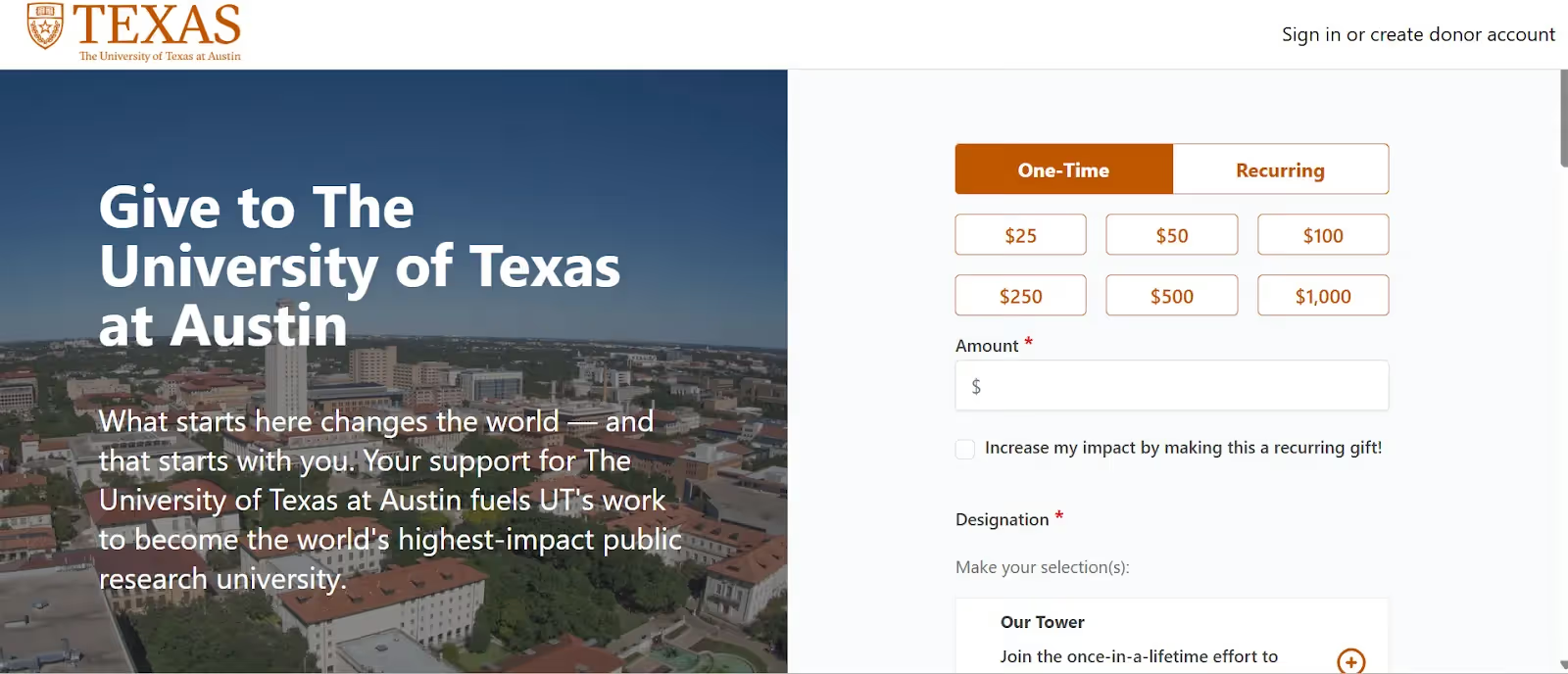
Why it works: By presenting diverse giving vehicles in a single, clearly structured page, UT Austin accommodates donors at every level and life stage. This breadth of options signals inclusivity and respect for individual donor circumstances, strengthening trust and inspiring larger, more strategic commitments.
Key feature: Detailed, side-by-side descriptions of multiple giving vehicles tailored to varied donor profiles.
Takeaway: Empower donors by offering clear, well-explained giving channels that match diverse preferences, maximizing both participation and gift size.
What they did: Stanford’s Giving site serves as a one-stop destination for every type of donor. “How to Make a Gift” section organizes every giving method into three clear columns: Give Now, Give Over Time, and Plan Your Gift. Under “Give Now,” donors can contribute online, by phone or mail, through stocks or wire transfers, or via memorial, matching, or international gifts. “Give Over Time” highlights new pledges, pledge payments, and recurring gifts, while “Plan Your Gift” details options like bequests, life-income gifts, donor-advised funds, and other asset-based contributions. Each link opens concise guidance so donors immediately understand requirements and benefits such as tax advantages or long-term impact.
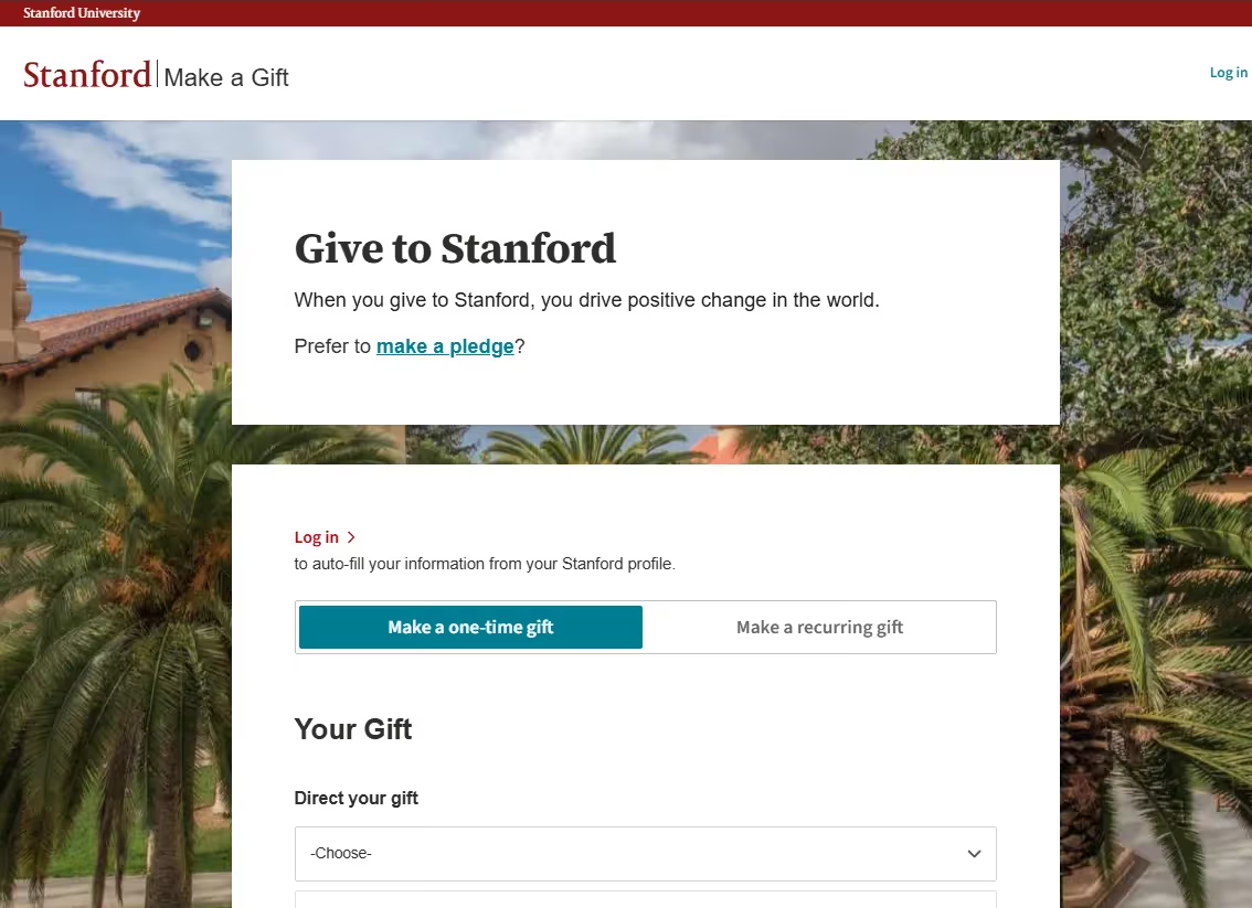
Why it works: This tiered layout simplifies a complex set of choices. Donors can instantly self-select whether they want to give immediately, spread payments over time, or create a legacy gift, without wading through multiple pages. By presenting planned giving alongside quick online options, Stanford invites both spontaneous and strategic donors, signaling professionalism and respect for different financial circumstances.
Key feature: Three-column structure, “Give Now,” “Give Over Time,” and “Plan Your Gift”, that clarifies intent and shortens the path to the right giving vehicle.
Takeaway: Grouping donation methods by timing and complexity helps donors quickly find an approach that fits their goals, increasing both participation and the likelihood of larger, long-term commitments.
Charity: water did something exemplary with online giving through their “100% Model”, ensuring every public donation funds clean water projects, while operational costs come from private supporters. Their donation page appeals to donors of all levels, highlighting that just $40 can bring one person reliable access to clean water. The giving form encourages small, meaningful gifts, reinforced by clear, low-pressure messaging and a welcoming design. Donors can also give in honor of someone special, adding a personal touch that widens participation.
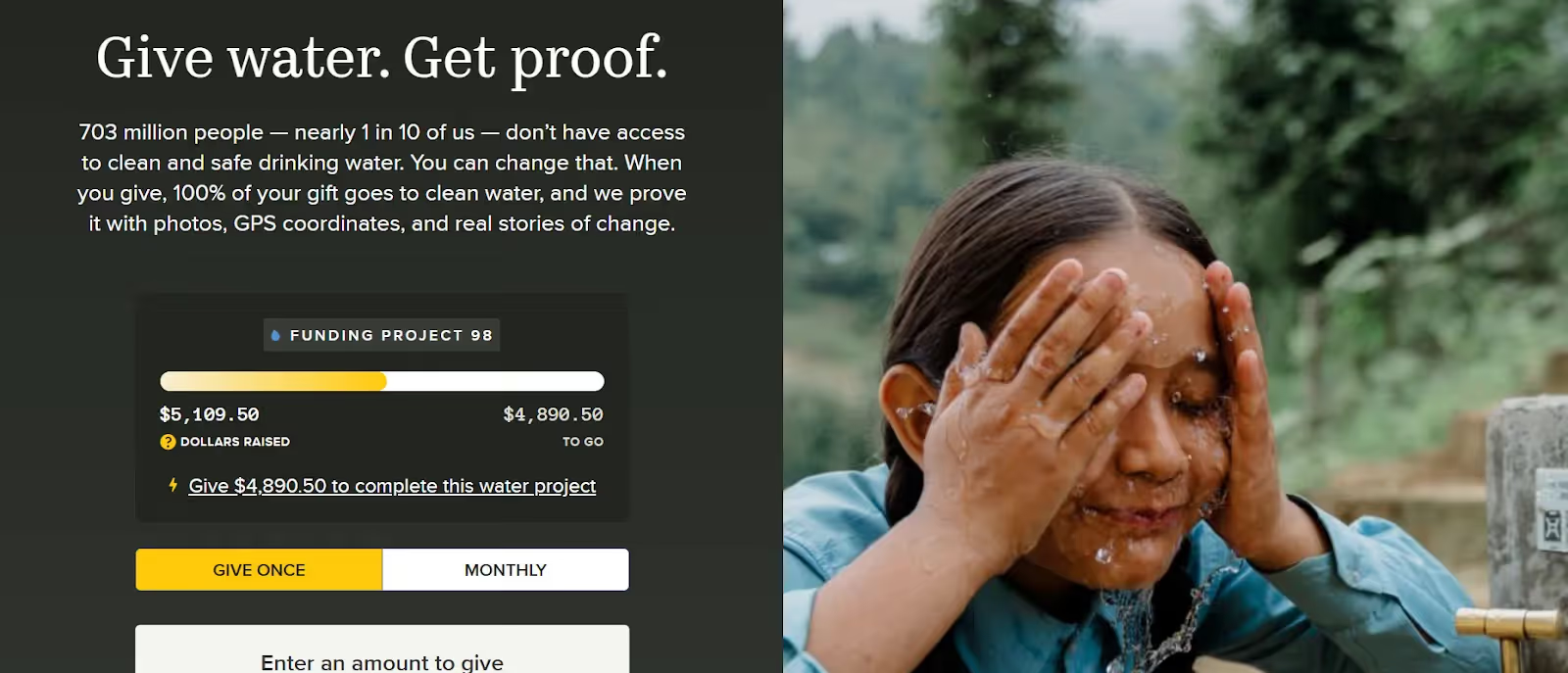
Why it works: The low-barrier entry point clearly states the tangible impact of every dollar, making action feel accessible to all. This transparent, approachable style removes hesitation from new and returning donors alike.
Key feature: Transparent cost-of-impact messaging (“$40 brings clean water to 1 person”) and personalized giving options.
Takeaway: A combination of radical transparency and inclusive, low-pressure donation options makes every supporter feel valued, lowering the barrier for action and building long-term loyalty.
The American Red Cross places credibility and transparency at the forefront on their donation page by prominently displaying their 4-star Charity Navigator rating.
They provide donors clear choices to give toward specific disaster relief efforts (such as wildfire relief or hurricane response) or general emergency preparedness, ensuring funds are allocated to donor-intended uses. These trust badges and fund-designation options reassure potential donors about the responsible handling of contributions in times of crisis.
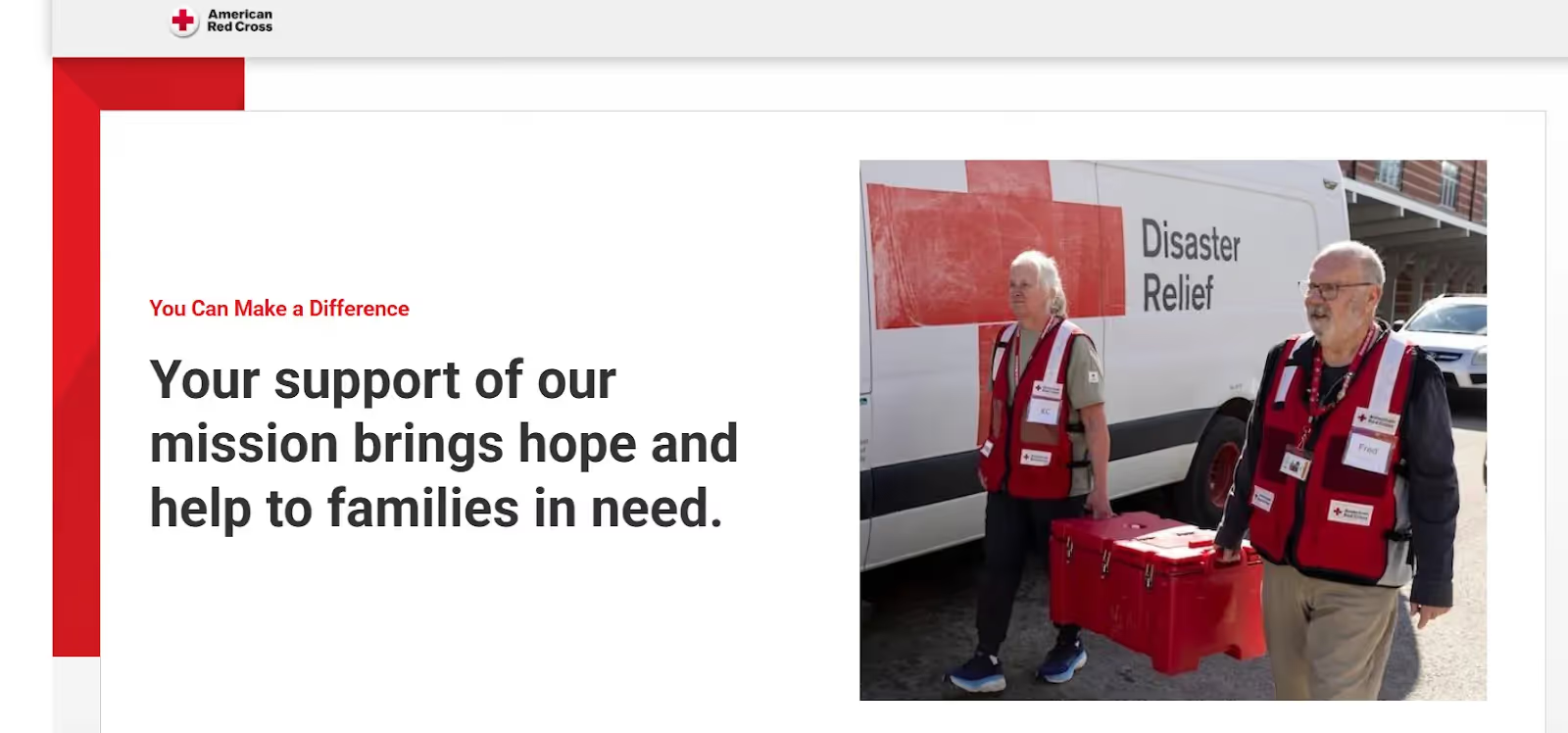
Why it works: In disaster fundraising, trust is paramount. The presence of third-party certifications and transparent fund allocation reduces donor skepticism and encourages first-time giving. Having clear, situational giving opportunities tied to recent emergencies increases relevance and urgency, motivating donors to act quickly.
Takeaway: Demonstrating strong third-party accountability and offering clear, cause-specific giving choices build donor confidence, especially important in emergency response fundraising.
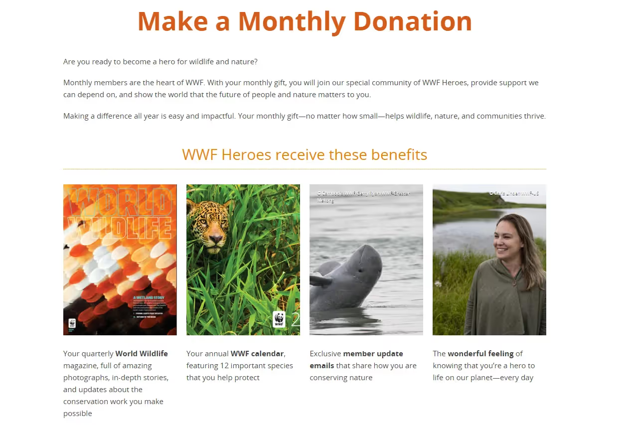
Why it works: WWF frames monthly giving as joining their "WWF Heroes" community, emphasizing how monthly donations provide "dependable support for global conservation efforts". Their donation pages offer membership benefits including quarterly World Wildlife magazine, annual calendars, and exclusive updates. They make monthly giving attractive by highlighting that 84% of spending goes directly to conservation and offering thank-you gifts for donations of $16+ per month.
Key feature: Monthly giving positioned as exclusive membership with tangible benefits.
Takeaway: Present recurring gifts as joining a special community with exclusive perks rather than just a payment method.
The examples above show that high-performing giving pages share a core set of traits:
These shared elements ensure donors can give with confidence, understand their impact, and complete a gift in minutes. These are key ingredients for sustainable, long-term fundraising success.
Use this short checklist when reviewing your site:
💡Almabase’s Giving Module integrates directly with RE NXT to automate processing and personalize appeals. → Learn more
Whether you run a K-12 school, university, or global nonprofit, we hope that these donation pages and our tips have proven that clear design, trust signals, and emotional storytelling go a long way in the effort to convert visitors into donors.
9 Best Donation Page Examples for Better Fundraising
Lorem ipsum dolor sit amet, consectetur adipiscing elit. Suspendisse varius enim in eros elementum tristique. Duis cursus, mi quis viverra ornare, eros dolor interdum nulla, ut commodo diam libero vitae erat. Aenean faucibus nibh et justo cursus id rutrum lorem imperdiet. Nunc ut sem vitae risus tristique posuere.

Anwesha Kiran
September 26, 2025
12 minutes
Higher ed institutions are competing for attention on more fronts than ever, whether that’s admissions, alumni giving, event sign-ups, or donor campaigns. A landing page isn’t just a brochure anymore. After all, it is often the point where someone decides whether to apply, register, or give.
Taking a page from one that doesn’t convert to one that does comes down to making a few key things working well together: how clearly the message comes across, how quickly the page loads, and whether the next step is obvious.
In this blog we cover 10 of the best college and university landing page examples, covering what each one does well, why it works, and what you can take from it.
Before we look at landing pages, it helps to be clear on what moves the needle. The strongest landing pages are built with a very specific outcome in mind. They’re not trying to speak to everyone at once. Instead, they’re focused on one audience and one outcome, whether that’s getting a prospective student to start an application or prompting an alum to make a gift.
These elements separate high-performing pages from the rest, and you’ll see them show up consistently in the examples ahead. It is worth thinking about what these elements would look like on the landing page of your own institution.
RISD's landing page looks like the work of someone who went to RISD. The layout is sparse and high-contrast, built around student artwork that fills the screen with almost no text competing for attention. It feels entirely intentional and arouses curiosity immediately. There’s also a clear sense of pride in showcasing the featured artwork.

What stands out:
RISD's landing page is a portfolio and a university website rolled into one, which makes a loud case for the institution.
The visuals carry the otherwise sparse-looking page, speaking to the confidence of the institution in the work showcased.

Why it works:
Takeaway for higher ed teams: Your visual identity should reflect your curriculum. A school with a generic layout has very little chance of making a lasting impression. RISD shows their own version of this with a blend of confidence and restraint.
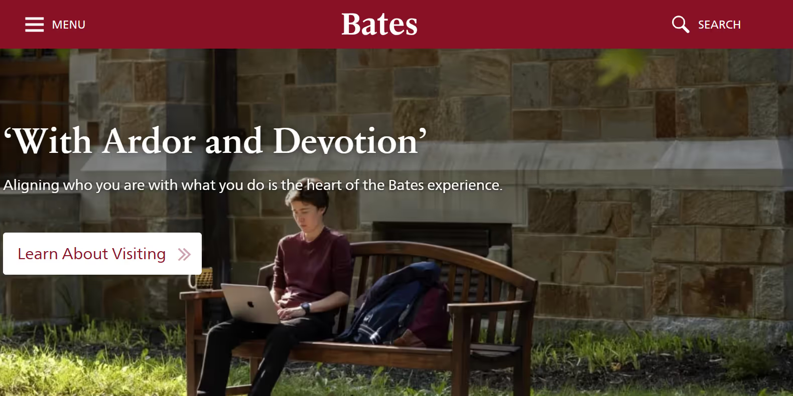
Bates College has always had a warmer, more personal feel and the landing page reflects that. It’s minimal and clean and it doesn’t try to do too much. Navigation is straightforward, and key experiences are easy to access without digging. The page trusts that visitors will engage when they’re ready, and in the meantime, it gets out of the way. This simplicity speaks to the confidence that the content is strong enough to carry it.
What stands out:
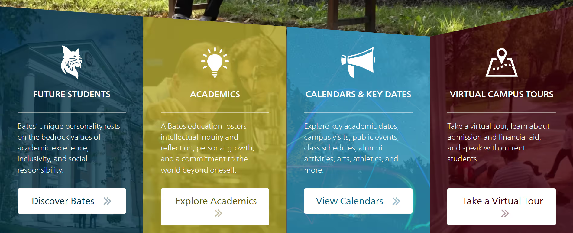
The “Take a Virtual Tour” feature shows up early and clearly. For a residential college, that’s a meaningful choice since it gives prospective students a sense of the campus without requiring them to search for it.
The site also extends beyond the landing page itself. The embedded social feed-style content (like the Instagram grid showing campus life, safety updates, student moments, and everyday activity) keeps the experience fresh.
Why it works:
Takeaway for higher ed teams:
Treat a virtual tour as more than a ‘good to have’ or just a nice addition. Placed well, it can do a lot of the work of a campus visit. More broadly, it’s worth identifying which experiences answer your audience’s biggest questions and making those easy to access.
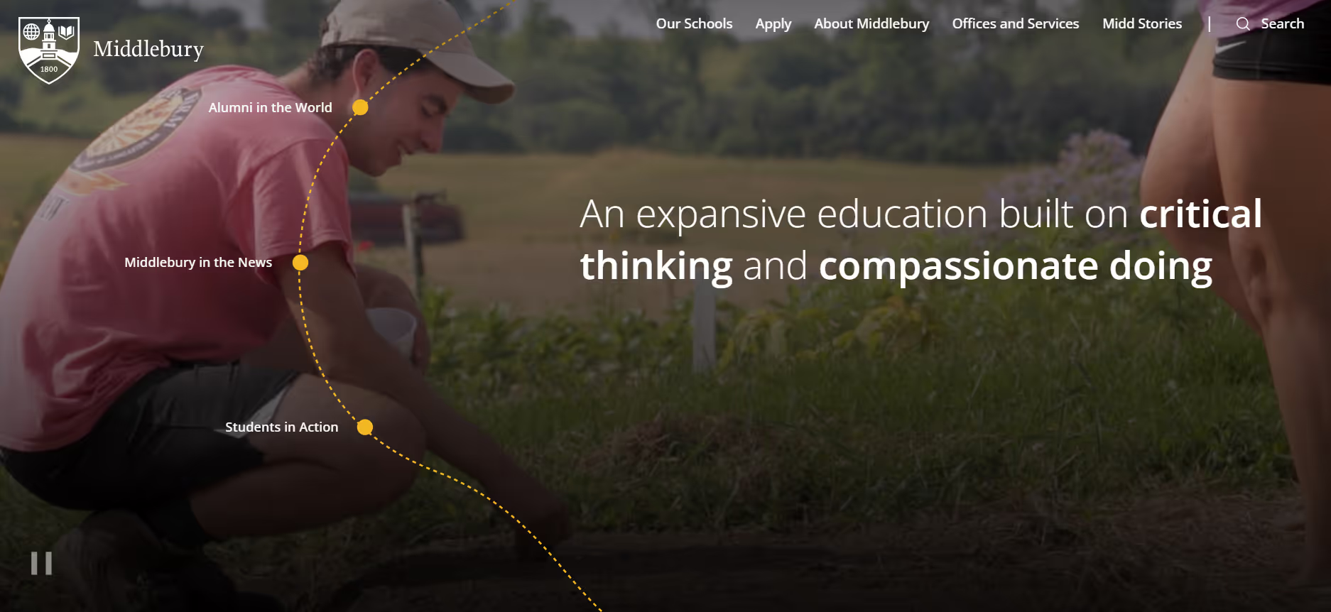
Middlebury’s landing page builds gradually as you move through it. Campus visuals lead into sections like “Projects to Build Our Future,” which ground the institution’s ambitions in specific, ongoing work rather than broad messaging. It unfolds gradually as you move through it, with different sections adding context.
What stands out:
The “Projects to Build Our Future” section gives visitors a more concrete outcome to engage with. It ties the institution’s ambitions to specific, ongoing work, which works better than abstract positioning.
Why it works:

Takeaway for higher ed teams:
Pages work better when they give visitors both something to feel and something to evaluate. Middlebury manages that balance well. Pairing storytelling with concrete examples can make a page more persuasive.
Johns Hopkins has a landing page that rewards scrolling. It leads with a statement first, supported by stories of real people and their specific experiences. It then opens to the broader research and healthcare identity of the university. The tab structure is also worth noting: where most sites stack navigation at the top, Johns Hopkins places it along the right-hand side, which changes the rhythm of how you move through the page and keeps you alert.

What stands out:
Starting with people shifts the tone of the page. Anecdotal evidence has a way of sticking and the page uses that to its advantage. It feels human before it feels impressive.
The right-side navigation also changes how you move through the experience, giving the page a more intentional feel.
Why it works:

Takeaway for higher ed teams:
The order of information matters as much as the information itself. Leading with people can make everything that follows easier to connect with. That’s a useful shift even for simpler pages. A static "About Us" copy cannot build trust the way live, up-to-date proof of impact does.
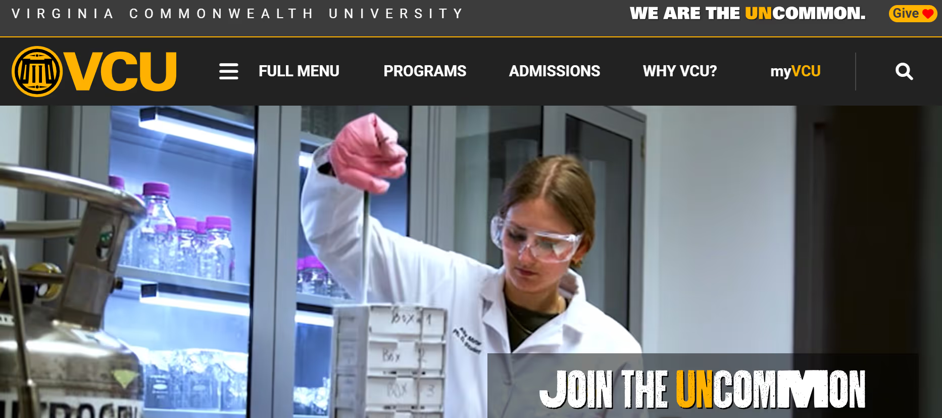
VCU’s landing page has a certain energy to it. The color does a lot of the work with the way the energetic yellow runs through the page. It looks purposeful and fresh. It shows up where you’d expect it to: on actions, on highlights, on anything that needs attention. Alongside that, the page leans heavily on student voices, particularly through video.
What stands out:
The testimonials are doing a lot of heavy lifting on this page. Instead of explaining what the university is like, the page lets students speak for themselves. The color then ties everything together, along with the inviting copy (“Join the Uncommon”), making it very clear where a visitor’s attention should be at all times.

Why it works:
Takeaway for higher ed teams:
If you have strong student voices, bring them forward. They answer questions better than polished copy or generic FAQs. The lesson here is to be smart about your institution colors by using them to do more than make a page look good.
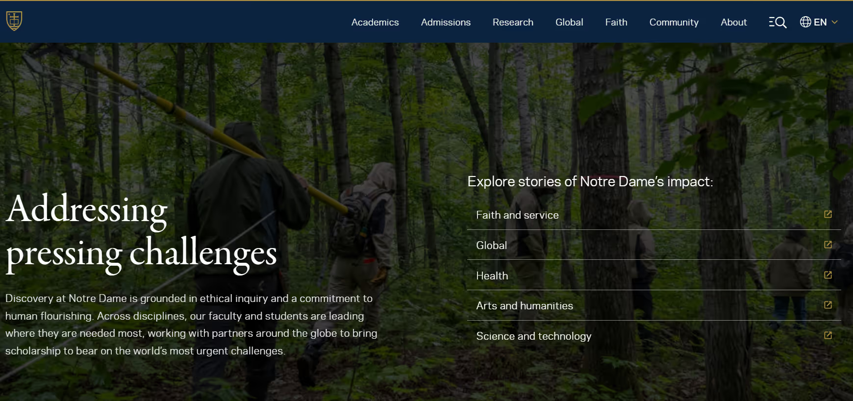
Notre Dame's landing page carries itself with the dignity of a place that knows exactly what it is. The layout is flat and modern and restraint shows up in the design as well as messaging. The copy is written to appeal to something emotional in the visitor while also demonstrating real impact. At the same time, the messaging is doing quite a bit: it’s not descriptive or abstract, it’s trying to connect the visitor to something real.

What stands out:
The balance in the copy has a sense of history and identity running through the messaging, but it’s consistently tied back to present-day impact and relevance.
It also doesn’t feel like different sections are speaking to different audiences in isolation. The same piece of copy can resonate with a prospective student while still holding meaning for an alum or donor. That overlap is difficult to get right, but Notre Dame gets close.
Why it works:
Takeaway for higher ed teams:
It helps to think about what a page is asking a visitor to feel, and what visible outcomes help achieve that. When those two align, the experience lands more effectively.
Brown's landing page is calm. The background imagery of campus scenes, architecture, everyday moments, and students on campus sits quietly behind the layout, while featured stories and updates carry more visual weight. Visitors don't get hit with everything at once and attention moves almost by itself toward what's meant to be read.
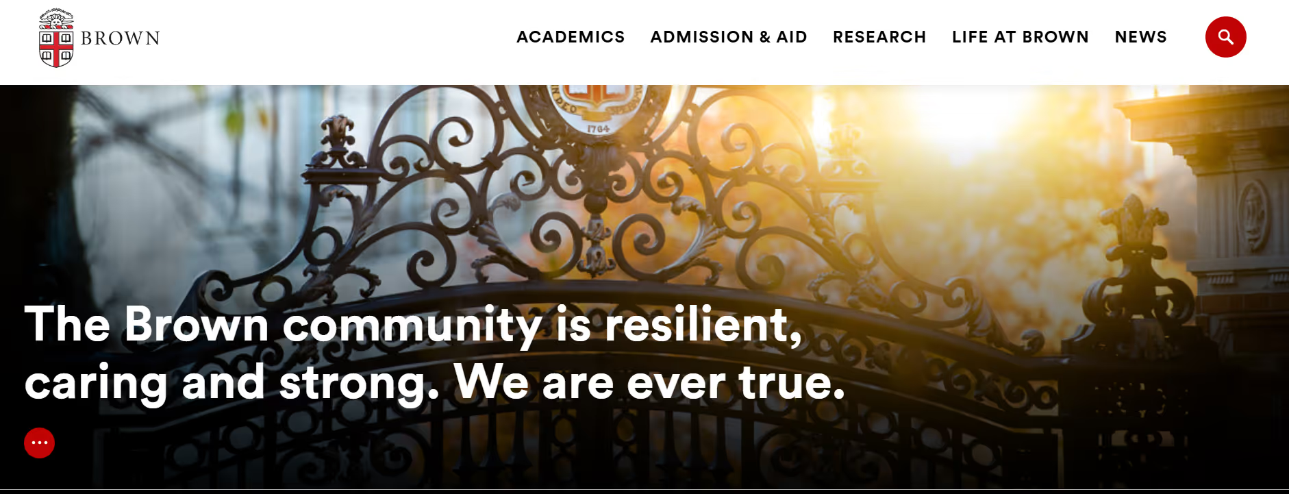
It's not a dramatic design choice, but it's consistent and done with a certain outcome in mind. The page makes a clear distinction between what's there to support and what's there to be engaged with.
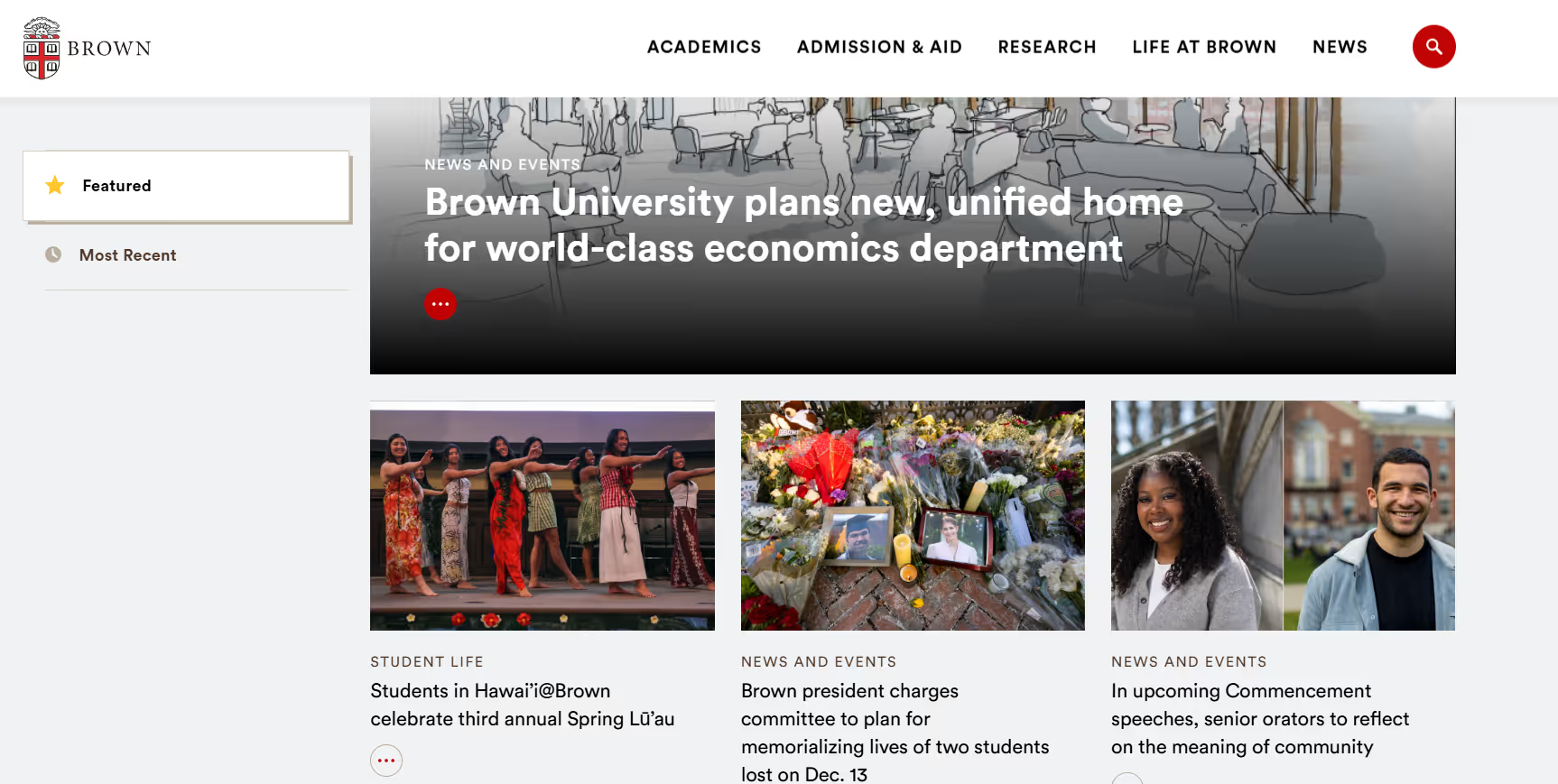
What stands out: The page separates background from content in a clean manner: supporting visuals stay subtle, while stories and updates are more prominent. This contrast does most of the work. There aren't extra borders, labels, or callouts trying to organize things. It's handled almost entirely through visual hierarchy that determines where your eye goes first.
Why it works:
Takeaway for higher ed teams:
If your landing page feels like it's doing too much at once, look at how many elements are competing equally for attention. Not everything needs to stand out. Let some parts of the page recede so the content that matters has room to land.
For a color-forward landing page, Clemson’s doesn’t overwhelm you with color. It’s actually quite controlled. Purple carries most of the page’s interactions: navigation, backgrounds, structure, while orange is used sparingly to highlight key actions and moments.

This contrast in color beautifully supports the strong messaging. It’s specific and real: what a student studied, what they’re working toward, and what they’ve done along the way. Then, as you move through the page, this narrative is backed up with numbers placed directly into the experience.
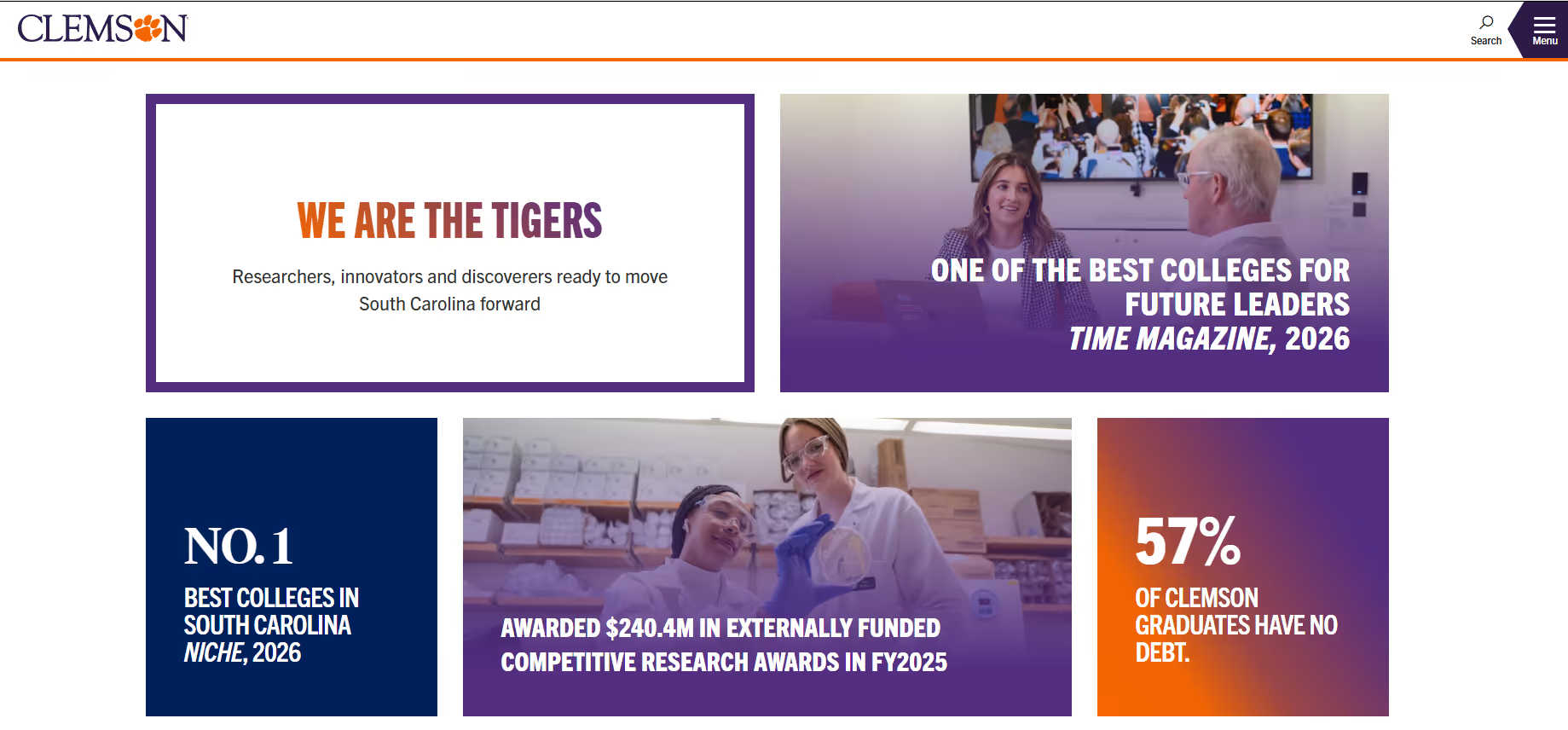
What stands out:
The pairing of student stories with specific stats gives you something to relate to, followed by something to verify it with. The stats themselves are also chosen carefully. They answer questions prospective students actually have such as:
That makes them easier to process and more relevant at the moment.
Why it works:
Takeaway for higher ed teams:
There’s usually more room to commit to your visual identity than it feels like. Consistency in branding and colors builds recognition faster than variety.
Don’t treat stories and stats as separate sections of your site. They work better together. A student story gets attention, but it’s the supporting data that makes it believable. When both show up in the same flow, the message tends to land faster and stick longer.
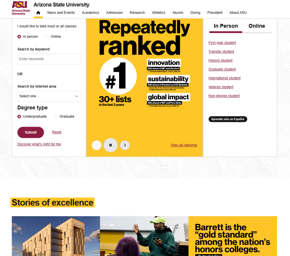
ASU's landing page doesn't start by explaining what the university offers. It starts with proof. Rankings, recognitions, and third-party validation show up immediately, before you've scrolled, before you've read anything long-form.

Claims like "#1 in Innovation" aren't tucked away on a rankings page, they're one of the first things you see. The rest of the page builds outward from there with programs, research, student experience, but the tone is set by the proof.
What stands out: Instead of introducing itself and then backing it up, ASU leads with what others have said about it. This order of presenting information changes how the rest of the page is read. When you see rankings and recognitions first, everything that follows feels more credible.
The visual system supports this too. The color palette and typography stay consistent across sections, so even as the content shifts, the page holds together and stays recognizable.
Why it works:
Takeaway for higher ed teams:
If you have strong external validation, it’s worth thinking about where it appears. Early placement can change how everything that follows is received. Even without major rankings, smaller proof points can serve a similar role.
Waterloo's landing page finds a balance that's harder to get right than it looks. There's enough visual content to draw you in, but enough substance to hold attention once you're there. Most university landing pages get this wrong in one direction or the other. Either the imagery takes over and there's nothing to actually read, or the page is so text-heavy that nothing pulls you through it.
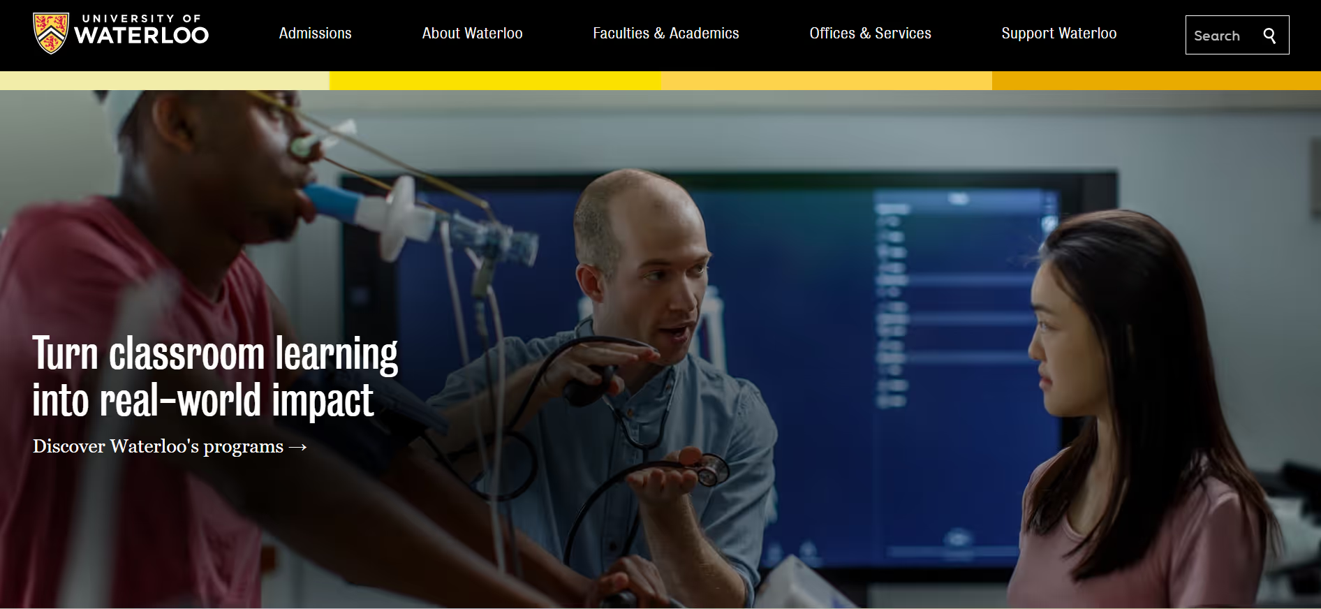
Waterloo doesn't have that problem. The visual and text elements work together rather than competing. Visuals ground the content; copy gives the visuals something to say. The result is a page that keeps visitors moving comfortably through it without ever feeling rushed or sparse.
What stands out:
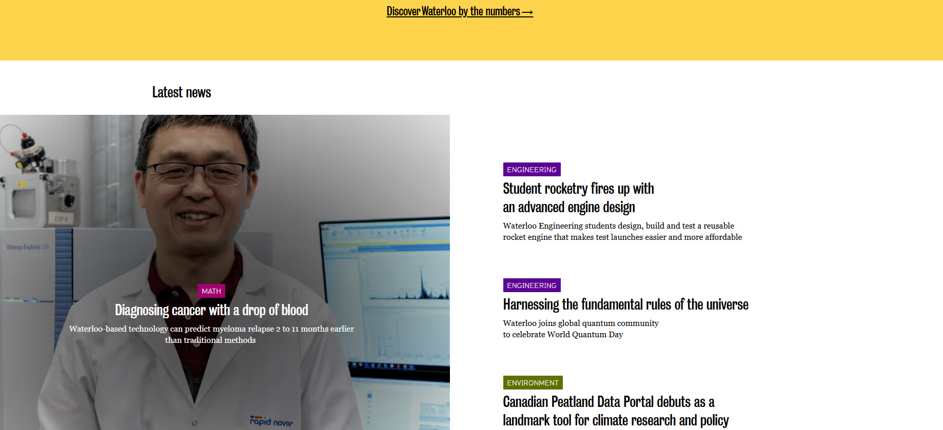
The focus is on what students and researchers have produced. Not what they could do, not what past graduates went on to build but what's happening now, shown directly.
Interactive elements let visitors go deeper into that work without leaving the page, which keeps the experience contained and the attention where it should be.
Why it works:
Takeaway for higher ed teams:
A lot of visitors are looking for proof, even if they don’t articulate it that way. Showing real work can answer that more effectively than promising future outcomes. Even small shifts in how that work is surfaced can make a difference. Also, treat the image-text ratio on your landing page as worth treating as a strategic decision, not a design preference. Too much of either and the page stops working as intended.
Before your next landing page goes live, it helps to run through a few basics.
Building a consistently good landing page across events, campaigns, and giving pages is harder than it looks.
Most advancement teams are working within fairly real constraints. A Day of Giving page might need to go live next week. An alumni event registration page might need to be ready the same day an email goes out. In those situations, waiting on design or development cycles isn’t always practical.
That’s usually where things start to break down. Pages get put together quickly using whatever tools are available. They work, but they don’t always feel connected to the institution, and the data they collect doesn’t always flow cleanly into the systems that need it.
This is exactly the gap Almabase is built to address.
Teams can create landing pages for events and campaigns without needing to involve design or engineering every time. The pages stay on-brand, and they connect to the rest of the institution’s systems in a way that reduces manual work later.
This looks like:
It’s worth remembering that these pages aren’t just functional. They shape how alumni and donors experience the institution in small but noticeable ways. A page that feels considered shows care and intention.
For teams that are currently stitching together pages from generic tools and then reconciling data afterward, a more integrated approach can make a difference.
Curious to see how that looks in practice? Get in touch with us.
Start with one goal and one audience. From there, pick a platform that does not require IT every time you need to make a change. Keep the headline clear, the form short, and the CTA easy to find. Use real visuals where you can, and always check the experience on mobile before publishing.
At the very least, you need a clear headline, a short explanation of why it matters, authentic visuals, and a CTA or form tied to one goal. Trust signals help too, things like testimonials, rankings, or outcomes data. For event pages, include the basics like date, time, and location, along with an easy registration flow. For giving pages, add things like a progress bar, impact statements, and a direct, specific ask.
Look for tools with no-code or low-code builders so non-technical teams can make updates themselves. Platforms like Almabase are designed for this, so teams can create and publish pages without waiting on developers. Template systems also help keep things consistent, even when different people are building pages.
A dedicated page for an event or initiative gives alumni a clear place to land, instead of sending them to a general website and hoping they find their way. When the page loads quickly, feels current, and makes it easy to register, more people follow through. Personal touches, like tailoring sections by class year or location, can make it feel even more relevant.
Yes, and often by a lot. A focused giving page tends to perform better than a general “Giving” section on a website. Things like progress bars, matching gift messaging, and live donor counts can create momentum. Mobile matters here more than anywhere else. If the form is hard to complete on a phone, people drop off.
Colleges use landing pages for events to drive sign-ups with a clear, focused experience. They’re focused entirely on a single event and make registration quick and easy with simple forms and fast confirmations. The same page can be updated after the event with highlights or next steps like applying or joining another event.

10 of the Best College Landing Pages
Lorem ipsum dolor sit amet, consectetur adipiscing elit. Suspendisse varius enim in eros elementum tristique. Duis cursus, mi quis viverra ornare, eros dolor interdum nulla, ut commodo diam libero vitae erat. Aenean faucibus nibh et justo cursus id rutrum lorem imperdiet. Nunc ut sem vitae risus tristique posuere.
Anwesha Kiran
April 20, 2026
12 minutes
Keeping your alumni community connected to your university is more critical than ever as the sector navigates recent fundraising challenges.
The 2023 Voluntary Support of Education survey found that, despite an increase in large donations, giving to higher education institutions declined 5% during the 2023 financial year, driven by decreases in individual giving. Alumni donations fell by a full 13%.
To recapture your audience’s attention and offset fundraising declines, we recommend making the most of all the tools at your disposal, including your alumni website. The most effective college websites use interactive features to turn alumni into active participants in your university’s culture.
With that in mind, here are five interactive tools to implement into your website to drive stronger alumni connectivity and long-term engagement.
Surveys help you better understand who your alumni are and what matters to them. Incorporate surveys into your website to allow alumni to provide feedback on your programs and make their voices heard.
Your surveys could cover topics such as:
Link to surveys on your alumni website’s homepage, blog posts, and email newsletter to get more responses. After the survey period, thank respondents, summarize the feedback you received, and describe how you’ll update your strategies in response to alumni input.
Virtual events have increasingly grown in popularity as a way to engage alumni who may live all over the country or world.
Studies have shown that 64% of alumni prefer benefits that can be accessed and utilized in real time (like digital resources or virtual events), but only 30% of organizations offer these benefits.
Use your website to promote and host online alumni events like:
Use an event platform that enables audience engagement, with tools like live chat and hand-raising features, to allow alumni to actively participate and get more value from your events.
Content marketing is an engaging and cost-effective way to keep alumni connected to your university. In fact, the average return on investment (ROI) for content marketing is $2.77 for every $1 spent, equal to 177% profit.
The following content strategies are the most effective for capturing and maintaining alumni attention:
Your website’s content plays a vital role in bringing your university’s mission to life for alumni, many of whom may have started to drift away after graduation. With compelling content that speaks to their interests, you can regain their attention and remind them of their love for their alma mater.
As an alumni, connecting with fellow grads can provide invaluable benefits, including networking, social, and mentorship opportunities. By including an alumni directory on your website, you can empower alums to reach out to peers in their field or city and build relationships.
Your alumni directory should include the following information to help alums connect:
Ensure alumni can use filters to search for fellow grads based on different criteria. For example, an alumna who lives in Chicago may want to find fellow alumni in her area to network with, so offer the option to search by location.
Driving greater interaction and engagement with your alumni requires an accessible website that all visitors can easily navigate.
That’s why we recommend incorporating accessibility features into your website, allowing users to adapt the site based on their needs. For example, your site should enable visitors to:
Kanopi’s guide to web accessibility tools recommends using a combination of accessibility testing solutions and manual tests to ensure your accessibility features are working properly. Manual testing requires using assistive technology, such as screen readers and a keyboard, to replicate the user experience.
This level of thorough testing will allow you to achieve a higher conformance level with regulations such as the Web Content Accessibility Guidelines. Remember, public universities must meet Levels A and AA conformance requirements.
With the recent declines in university fundraising and alumni giving, your university needs a comprehensive engagement strategy that maximizes every interaction, including digital ones.
If you need support to build your website’s interactive features, work with a higher-ed web design consultant. These professionals can design custom functionality to engage your audience on a higher level and incorporate accessibility features to enhance equity and provide a positive user experience.

5 Interactive Website Features to Drive Alumni Connectivity
Lorem ipsum dolor sit amet, consectetur adipiscing elit. Suspendisse varius enim in eros elementum tristique. Duis cursus, mi quis viverra ornare, eros dolor interdum nulla, ut commodo diam libero vitae erat. Aenean faucibus nibh et justo cursus id rutrum lorem imperdiet. Nunc ut sem vitae risus tristique posuere.
%201.svg)
%201.svg)
%204.svg)


.svg)